
I spoke in a previous blog post about recolouring designs and the way it can be completely transformative. Well that's what happened with the Autumn Splendour collection. I had some patterns left over from my Pink and Black Boho set. I added an HSL adjustment layer in Affinity Designer and tuned the colours to get these incredible Autumn hues.
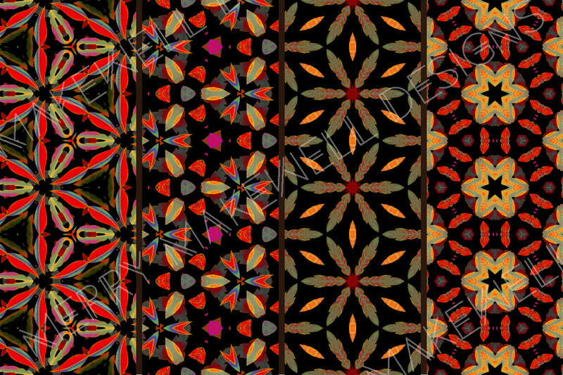
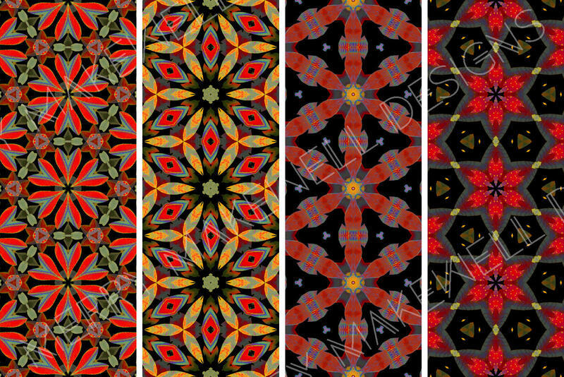
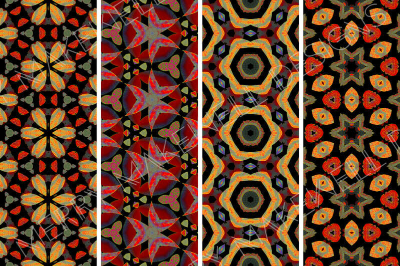
I wasn't sure if the patterns worked as a set at first, but the more I looked at it the more it grew on me. Now I absolutely love it! So much so that I was inspired to create a brand new digital paper set based on the same colour palette. Which resulted in "Fall Into Autumn".
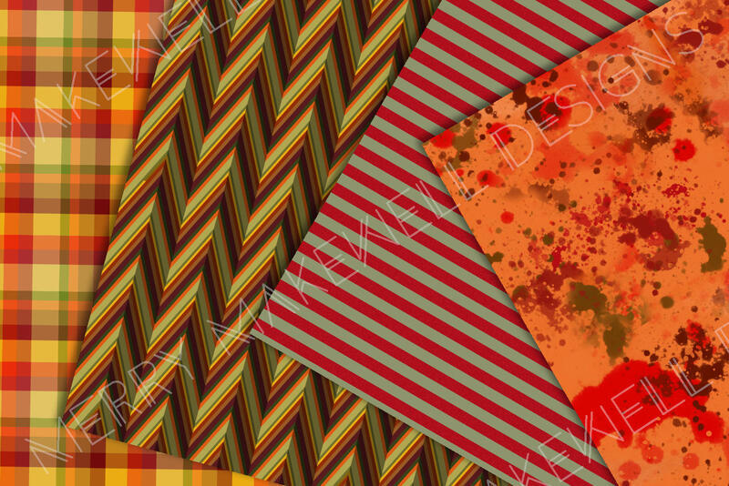
The "Fall into Autumn" collection is an eclectic mix of patterns, textures and backgrounds featuring plaids, stipes, geometrics, paint effects and illustration. I was thinking about making mini albums when I put this collection together and how the different designs would mix and match in a project like that.
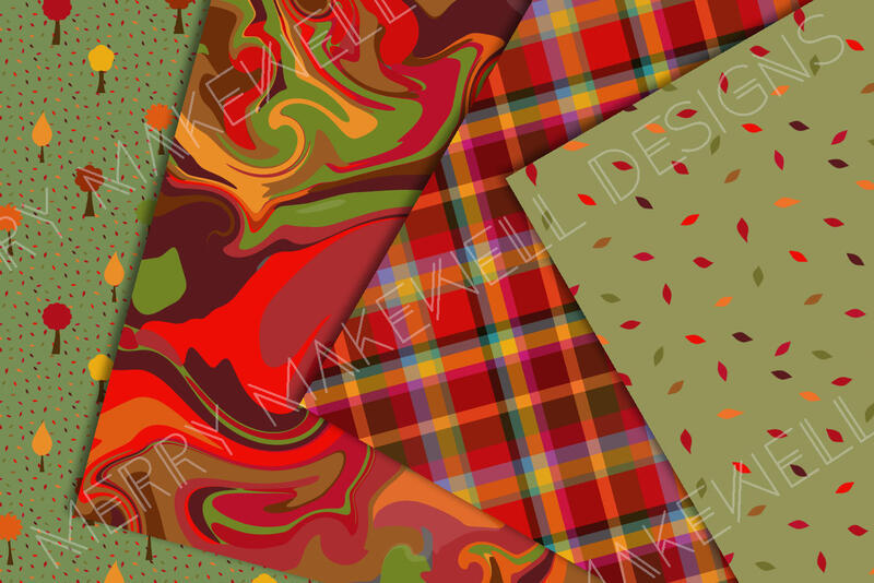
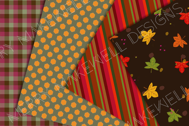
.
The two collections are quite different, but because the colour palette is the same in both they could be used in conjunction with one another for even greater versatility.
"Autumn Splendour" and "Fall into Autumn" are both available for licensed download in my Creative Fabrica Shop or at Spoonflower.


