|
Spoonflower have recently released Gold and Silver metallic wallpapers. Designs will be printed on a gold or silver base to give a shiny, metallic finish. Having looked through my design catalogue there are a few designs that are just crying out to be printed on a gold or silver base. Here are my top 5 pattern recommendations for Spoonflower's new metallic wallpaper range. 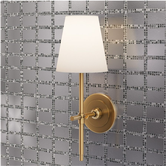 The silver base will complement and enhance the mirror tile effect of this design. Although silver is the obvious choice for the base, it looks pretty good on gold too. Mirror Tiles is a similar design that would also pair perfectly with the silver wallpaper base. 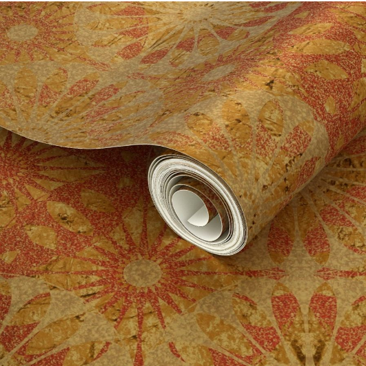 The original design features reddish-pink geometry interspersed with golden accents. The gold wallpaper base adds an enticing warmth and richness to the original colours and gives the gold accents a more realistic feel. 3. Patterns from the Autumn Splendour collection These patterns are excellent candidates for the gold metallic base, which adds a warm glow to the yellow, orange and red hues. There are 17 variations of the Doodled Doodlebugs pattern on 10 different background colours. The gold and silver bases affect each of the background colours in different ways. In most cases the colours are warmed up when placed on the gold base, but in some cases the colours are quite changed - for example the purple background takes on a warm chestnut hue (as shown above) and the blue background appears more emerald. In any case the results are striking. The cool, subtle blues in this design are a natural match for the silver metallic base. These are just a few of the nearly 500 designs in my Spoonflower shop. There are so many other designs that could have featured in this post so why not pay my shop a visit and see what other gems you can find?
0 Comments
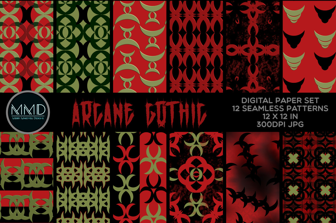 This collection came about as the result of an experiment. I was exploring the idea of using a single shape to create collections by playing with layout and creating composite shapes. Some of the resulting composites seemed a little occultish to me and thus "Arcane Gothic" was born. It is a limited-palette set of patterns with hints of the occult and Gothic-esque symbols and motifs. It could be a great alternative for Halloween - but would work well all year round! Think Whimsigoth aesthetic and Goth wedding invitations and décor. Funnily enough the "sister" collection that sparked this one is its diametrical opposite! It's called "A Groovy Kind of Pink". (I think that the name says it all!) I will introduce it in a separate blog post. In the meantime they are both available to download in my Creative Fabrica Shop and on Spoonflower.
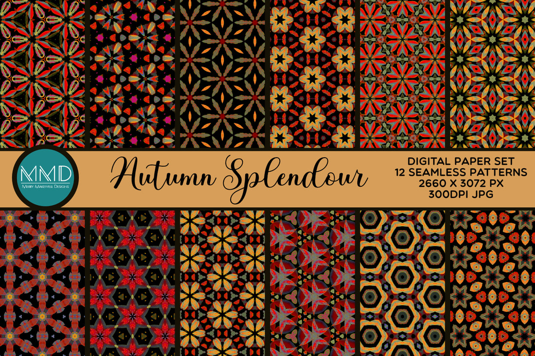 I spoke in a previous blog post about recolouring designs and the way it can be completely transformative. Well that's what happened with the Autumn Splendour collection. I had some patterns left over from my Pink and Black Boho set. I added an HSL adjustment layer in Affinity Designer and tuned the colours to get these incredible Autumn hues. I wasn't sure if the patterns worked as a set at first, but the more I looked at it the more it grew on me. Now I absolutely love it! So much so that I was inspired to create a brand new digital paper set based on the same colour palette. Which resulted in "Fall Into Autumn". 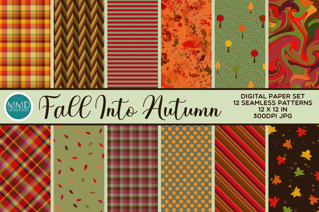 The "Fall into Autumn" collection is an eclectic mix of patterns, textures and backgrounds featuring plaids, stipes, geometrics, paint effects and illustration. I was thinking about making mini albums when I put this collection together and how the different designs would mix and match in a project like that. .
The two collections are quite different, but because the colour palette is the same in both they could be used in conjunction with one another for even greater versatility. "Autumn Splendour" and "Fall into Autumn" are both available for licensed download in my Creative Fabrica Shop or at Spoonflower. One of the reasons that I got into surface pattern design at all was because I wanted to create beautiful patterned papers to use for cardmaking, scrapbooking and paper crafting. Up until now I haven't made any of my designs available on paper, but I recently opened a new store on Creative Fabrica.  Creative Fabrica is a graphics resource website where you can download all manner of graphics and fonts - from clip art to cut files, Photoshop brushes to patterns and everything in between! While not directly on paper, my design collections will be available to download and use in your own creative projects - whether that is printing them out to use in scrapbooks or on cards, or using them to create product packaging or posters. Check the Creative Fabrica website for the EULA (end user licence agreement) and terms of use. The latest Spoonflower Design Challenge is another collaboration with East Fork Pottery. They have just released their latest glaze colours Butter and Piglet. The challenge was to create a design featuring those two colours primarily.
In the end I didn't use Pannacotta, but a lighter tint of it because the contrast with the lighter colour was better. The result is very soft and delicate. I think that it would make a great fabric for Spring/Summer projects, or alternatively adorable baby wear or nursery décor. See the design on Spoonflower and see how it works on a range of home décor products. 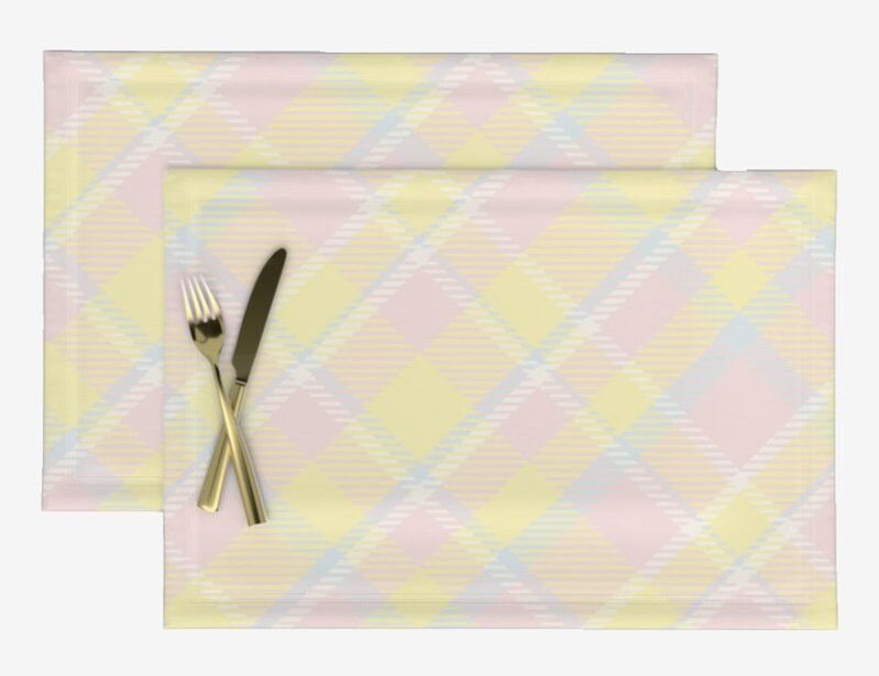  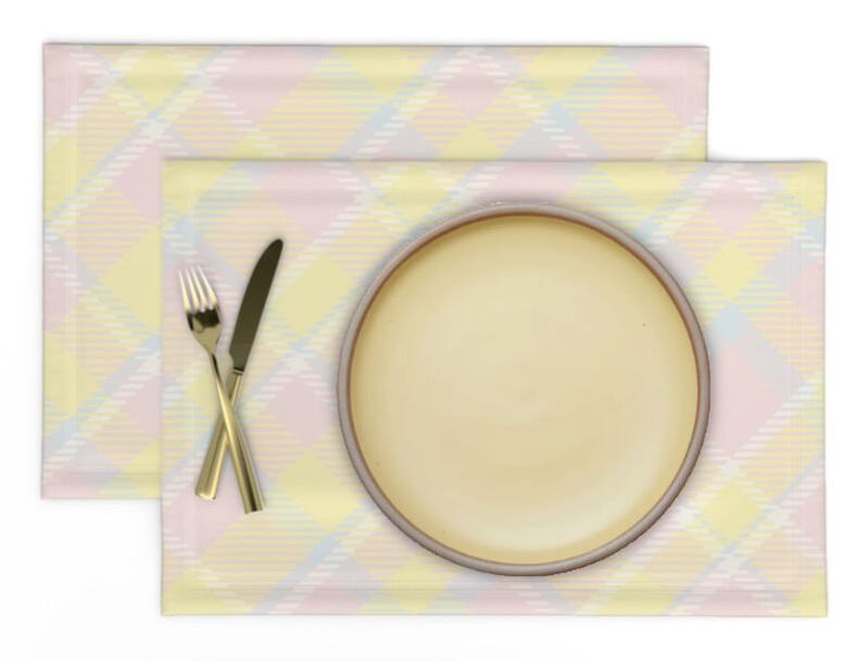 Now that I've learnt how to make plaid patterns I am officially mad for plaid! Expect to see many iterations of plaid in my future portfolio 😄. If you like this design please vote for me here. Voting ends 4th April 2023 at 3pm EST. (Fair warning there are a LOT of entries, so put aside a good half hour and grab yourself a cuppa.)
|
AuthorI like bold geometric patterns, florals and bright colours. Archives
May 2024
Categories
All
|

 RSS Feed
Site powered by Weebly. Managed by Porkbun