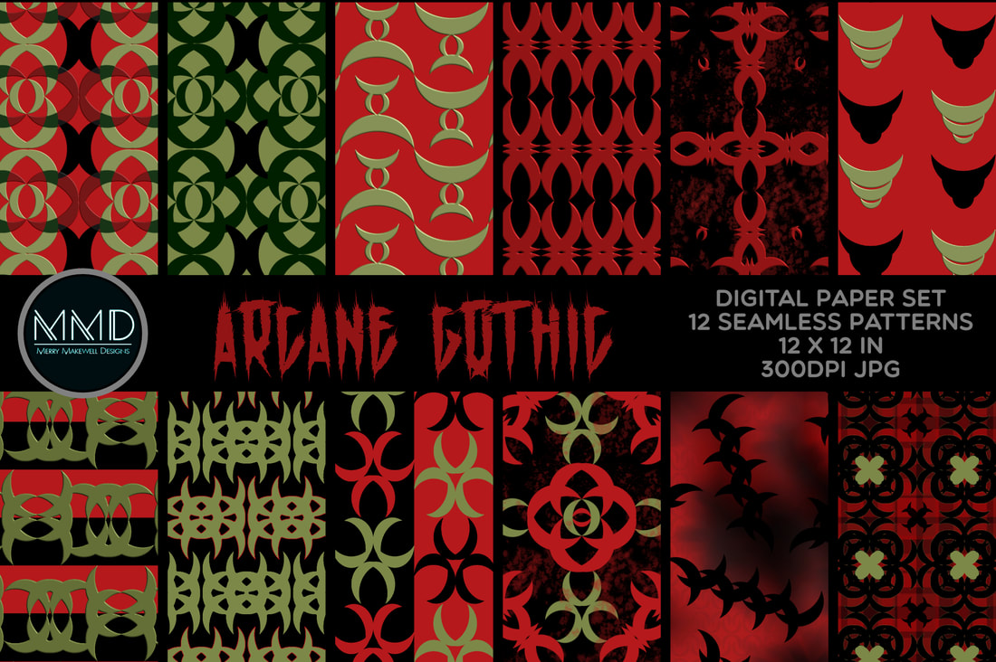
 This collection came about as the result of an experiment. I was exploring the idea of using a single shape to create collections by playing with layout and creating composite shapes. Some of the resulting composites seemed a little occultish to me and thus "Arcane Gothic" was born. It is a limited-palette set of patterns with hints of the occult and Gothic-esque symbols and motifs. It could be a great alternative for Halloween - but would work well all year round! Think Whimsigoth aesthetic and Goth wedding invitations and décor. Funnily enough the "sister" collection that sparked this one is its diametrical opposite! It's called "A Groovy Kind of Pink". (I think that the name says it all!) I will introduce it in a separate blog post. In the meantime they are both available to download in my Creative Fabrica Shop and on Spoonflower.
0 Comments
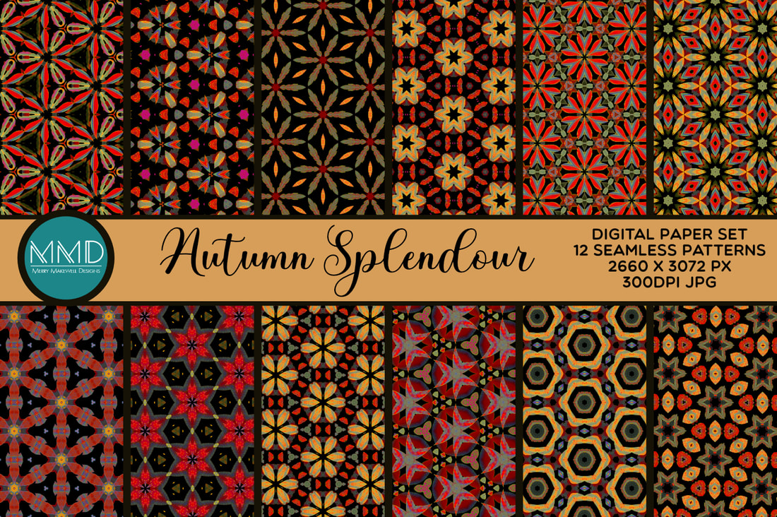 I spoke in a previous blog post about recolouring designs and the way it can be completely transformative. Well that's what happened with the Autumn Splendour collection. I had some patterns left over from my Pink and Black Boho set. I added an HSL adjustment layer in Affinity Designer and tuned the colours to get these incredible Autumn hues. I wasn't sure if the patterns worked as a set at first, but the more I looked at it the more it grew on me. Now I absolutely love it! So much so that I was inspired to create a brand new digital paper set based on the same colour palette. Which resulted in "Fall Into Autumn". 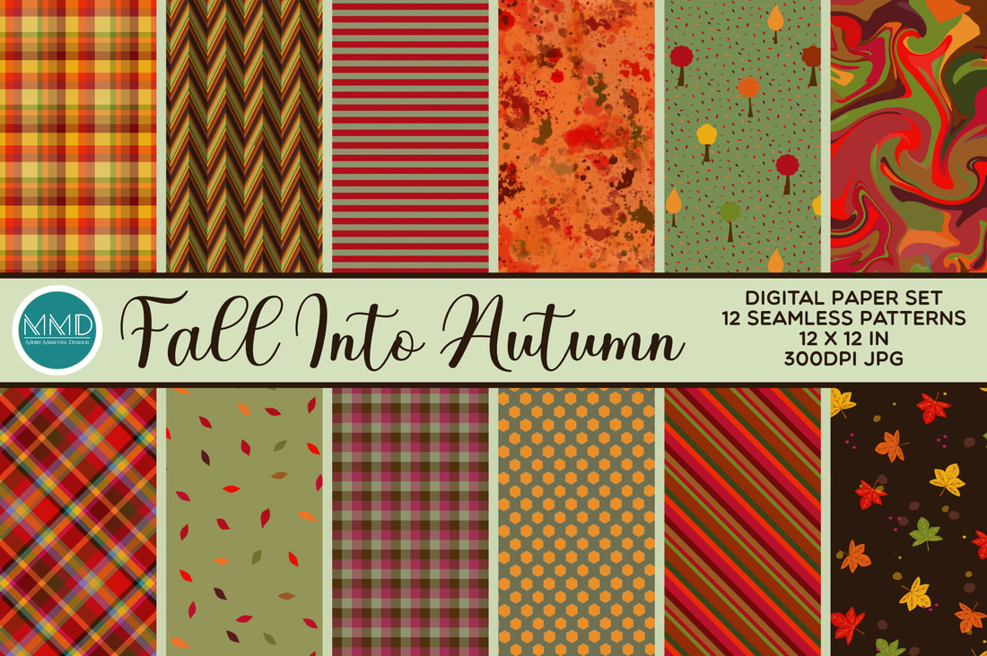 The "Fall into Autumn" collection is an eclectic mix of patterns, textures and backgrounds featuring plaids, stipes, geometrics, paint effects and illustration. I was thinking about making mini albums when I put this collection together and how the different designs would mix and match in a project like that. .
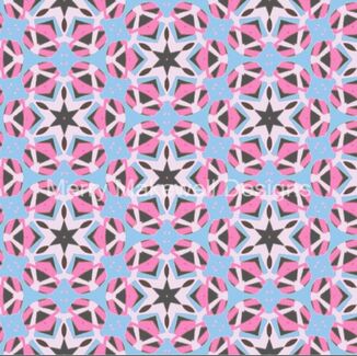
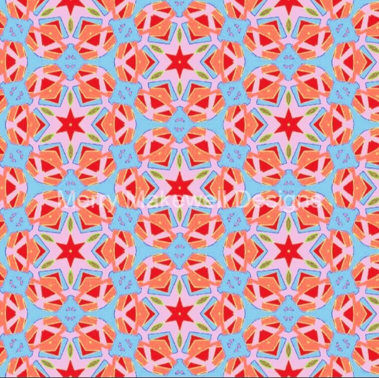
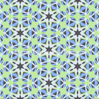
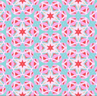
The two collections are quite different, but because the colour palette is the same in both they could be used in conjunction with one another for even greater versatility. "Autumn Splendour" and "Fall into Autumn" are both available for licensed download in my Creative Fabrica Shop or at Spoonflower. Way back in 2019 I created a design for the Spoonflower Design Challenge - Halloween Embroidery. I've been thinking about turning it into a complete collection (as I only had 2 Halloween designs) for a while and finally got around to finishing it off a couple of weeks ago 🙌. So without further ado, I present Halloween Hysteria - a spooky, fun and vibrant collection featuring licensed artwork by DigitalArtsi. Watch a short video showreel on YouTube here. 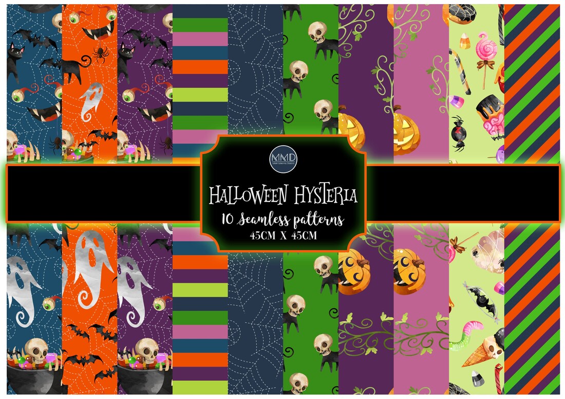 There are several designs that I have numerous colour options for. There's something magical about recolouring a design and seeing new elements that were not prominent come to the fore. In some cases the design can transform into something completely different. One such set of patterns is "Cowrie Star". This was one of the first patterns that I created when I first started getting interested in pattern design. The original colouring was an incongruous combination of sky blue, hot pink, lilac and yellow, with dark grey accents. I decided that I didn't like it so I attempted to recolour it (at that point it was still quite early in my design journey). I ended up with a really bold orange, blue red and pink combination. I actually quite like it, but it is quite difficult to look at! I wouldn't want an entire outfit made from it, but it would work wonderfully as a bold accent or trim, or in patchwork and quilting.
In the second example the stars are much more prominent and the detail in the surrounding elements is much more noticeable. For a while it was just these two variations, but I can never resist tinkering so now there are an additional five variants.
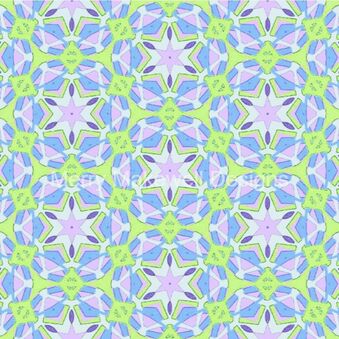 In the first two versions the stars and the surrounding, intersecting rings are quite prominent. The desaturated orange/blue version shows more of the background detail. In the pink/sky blue version the star motifs and the surrounding segments look more like isolated motifs compared with the previous three versions. Finally in the last version the pattern looks very different - the larger outer star is more prominent and the surrounding segments look more connected and are more of a feature than in any of the previous examples.
I had a lot of fun trying out all these colour combinations and I really like the results - especially the mint/blue and the retro green with the 70s vibe. I could probably keep going, but at some point you just have to stop! So that will be all... (for now). All of the variants except the original are available to buy in my Spoonflower and Redbubble shops. Spoonflower Shop Redbubble Shop We're a month into Spring. How is it the end of April already?!! Anyway I've just released a new pattern in my Spoonflower shop - "Spring Woodland Wildlife". It's a fun pattern featuring blossoming trees and woodland wildlife in a fresh, soft colour palette - perfect for kid's clothes, soft furnishings and bags. 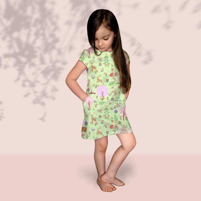 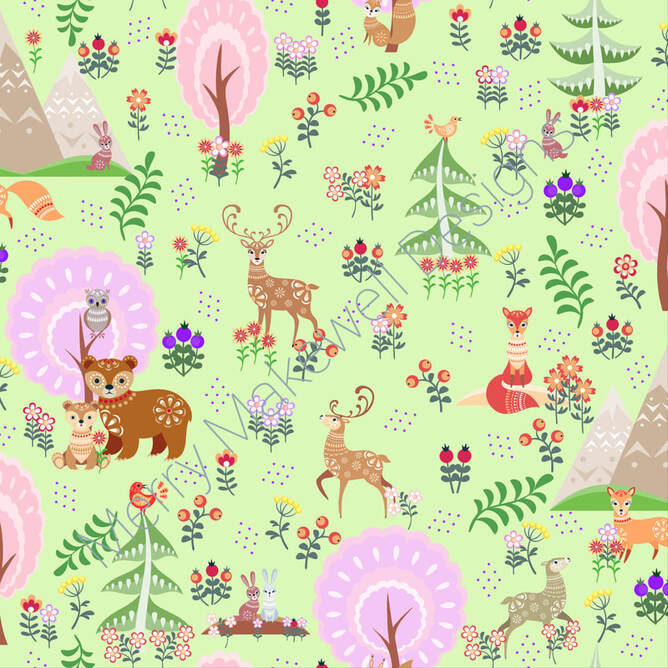 |
AuthorI like bold geometric patterns, florals and bright colours. Archives
May 2024
Categories
All
|

 RSS Feed
Site powered by Weebly. Managed by Porkbun