|
The Spoonflower design challenge this week is a collaboration with East Fork Pottery. "East Fork makes and sells a full range of beautiful, durable, ceramic dinnerware... from regional materials. The collection is unfussy and timeless—made to use every day and offered in a dynamic palette of year-round neutrals and fresh, seasonal colours." The stipulation for the challenge was to create a colour palette featuring at least one of the following two collection colours as the main colour:  I was inspired by a flat lay image of a set of East Fork dishes and created my colour palette from that. 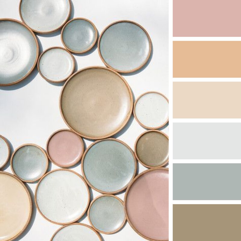 This is the final pattern design that I submitted:  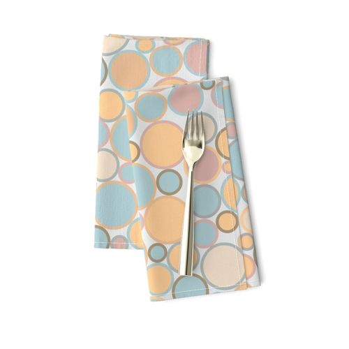 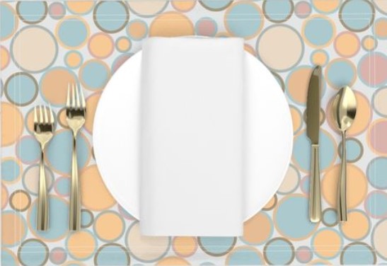 "Scattered Dishes" is available to buy on Spoonflower.
0 Comments
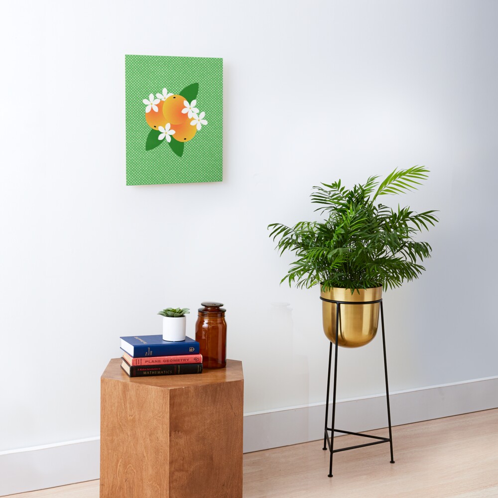 One of the Spoonflower Design Challenges last year was "Pop Art Citrus". I created a repeat pattern that I called "Orange Blossom Pop" featuring groups of oranges with orange blossoms and leaves on a polka dot background. The original background was a shade of royal blue. I didn't really love it so I went back and made some adjustments and, as always, tried a few different colourways. One of those was the green background shown above. I really liked the bold motif so I took away the other elements to create a piece of wall art. Get the art print in my Redbubble shop and see the design on lots of other products here.
|
AuthorI like bold geometric patterns, florals and bright colours. Archives
May 2024
Categories
All
|
 RSS Feed
Site powered by Weebly. Managed by Porkbun