|
We're a month into Spring. How is it the end of April already?!! Anyway I've just released a new pattern in my Spoonflower shop - "Spring Woodland Wildlife". It's a fun pattern featuring blossoming trees and woodland wildlife in a fresh, soft colour palette - perfect for kid's clothes, soft furnishings and bags. 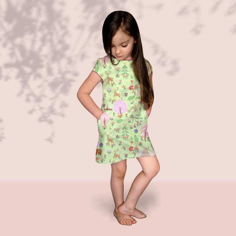 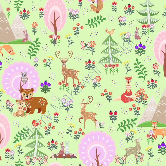
0 Comments
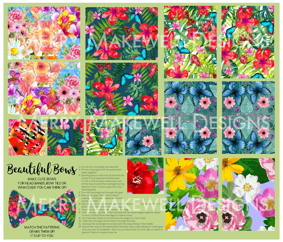
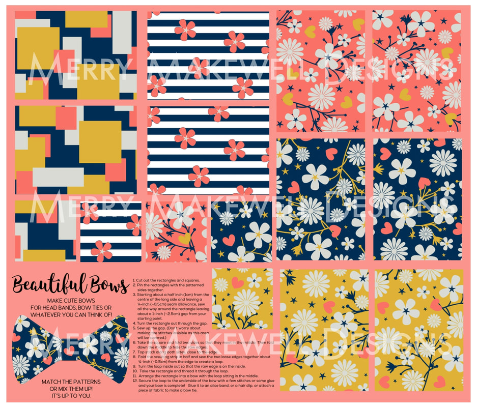
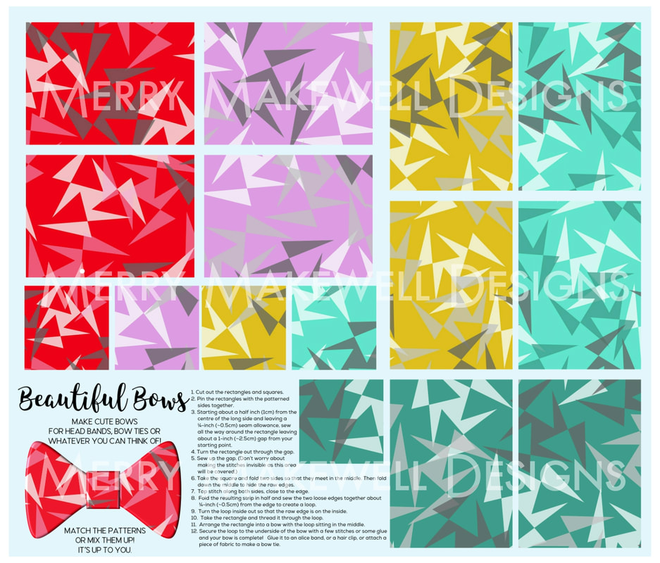
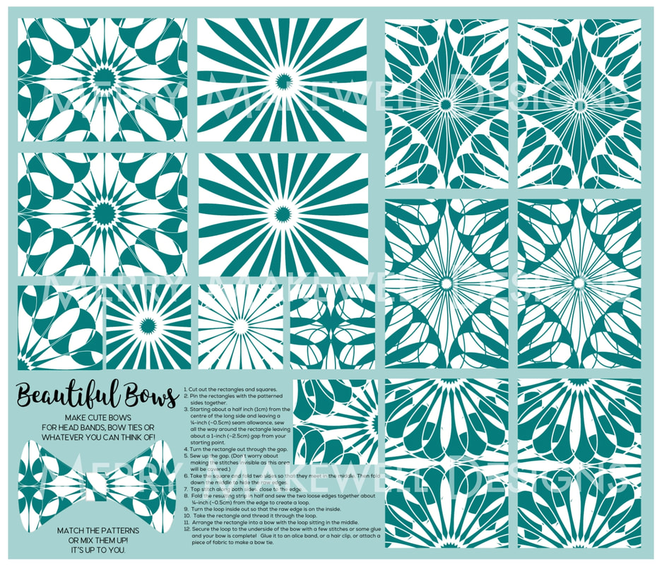
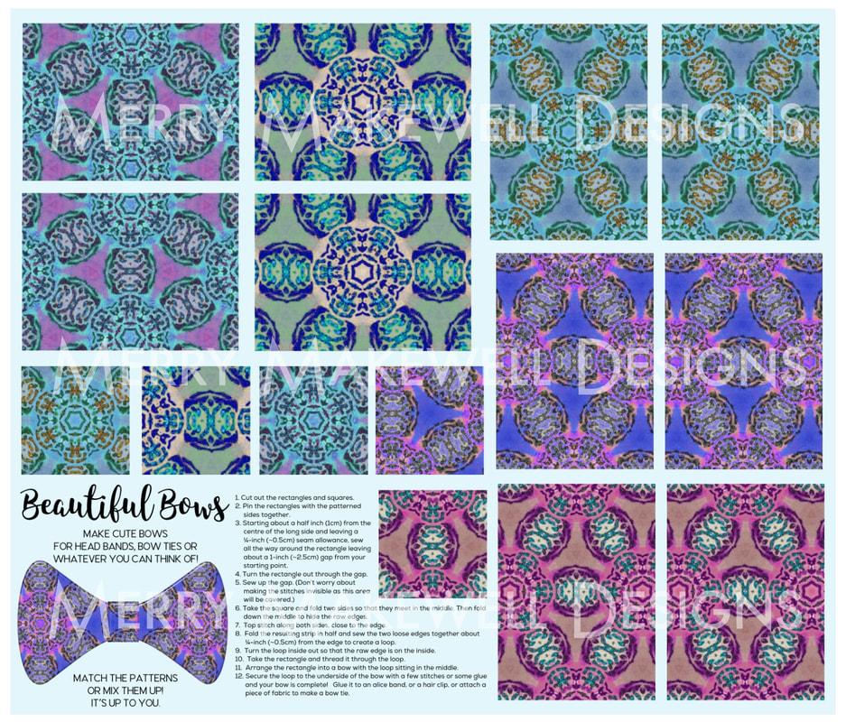
Towards the end of last year I designed a series of Cut and Sew fat quarters on Spoonflower for creating fabric bows. The fat quarters consist of five pairs of patterns that can be cut out and sewn together to create cute bows that can then be attached to hair clips or brooch backs, or used as accessories on clothing and bags. Instructions for putting the bows together are included on the fat quarter panel. The beauty of the panels is that you only need one fat quarter to create 5 different bows as opposed to having to use 5 different fat quarters in each of the designs. This would be an ideal project for a young sewist or a beginner, but would be a quick and easy make for the more experienced sewist. And if you don't sew, the bows can still be made using fabric glue instead. Attach the finished bows to hair bands or hair clips or create a fabric band and wear them as a bow tie. 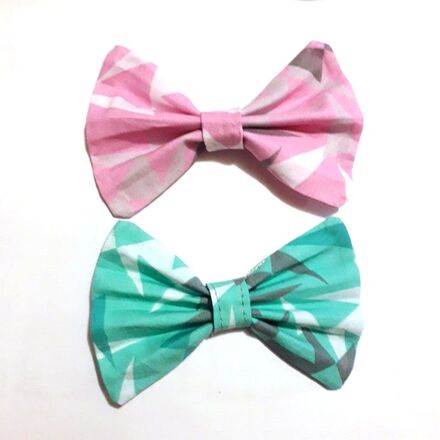 Watch this short video to see how easy it is to put the bows together then head over to my Spoonflower shop to get the fat quarter panels.  Photo by Debby Hudson on Unsplash So here we are, back in lockdown. I honestly didn't think that we'd be here at this point. As I work from home and don't really go out much, for the most part living in lockdown hasn't really affected my day-to-day life and I actually really enjoyed it last year.
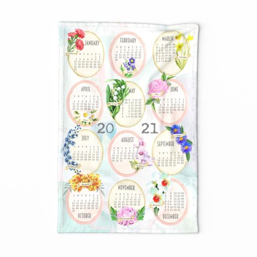
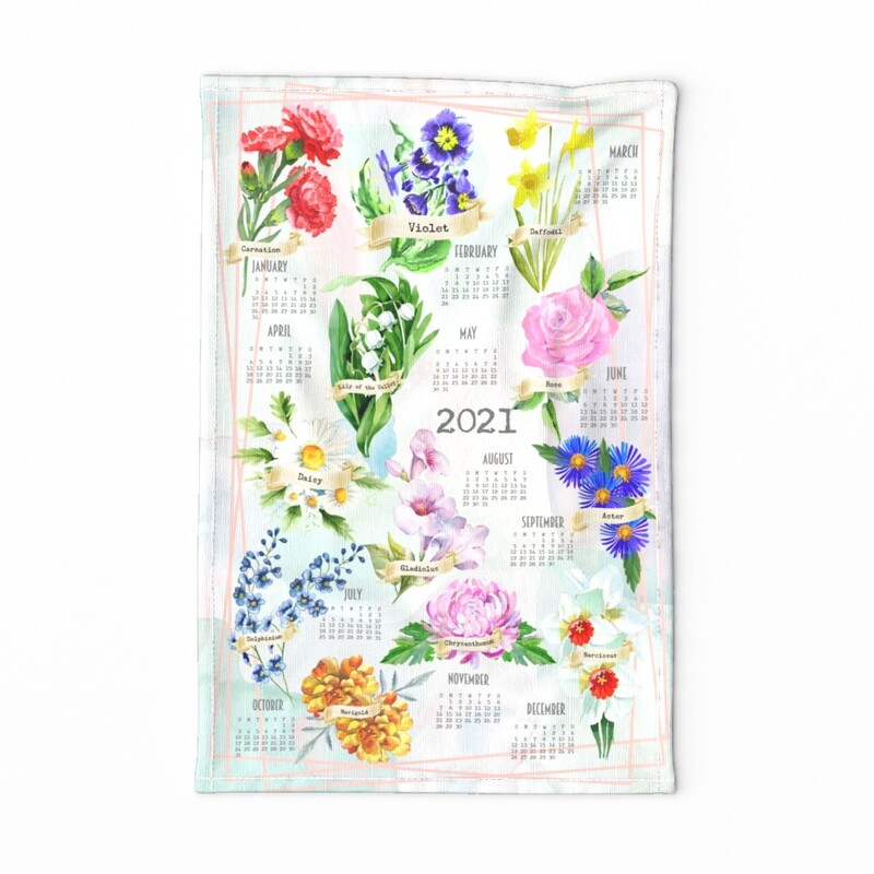
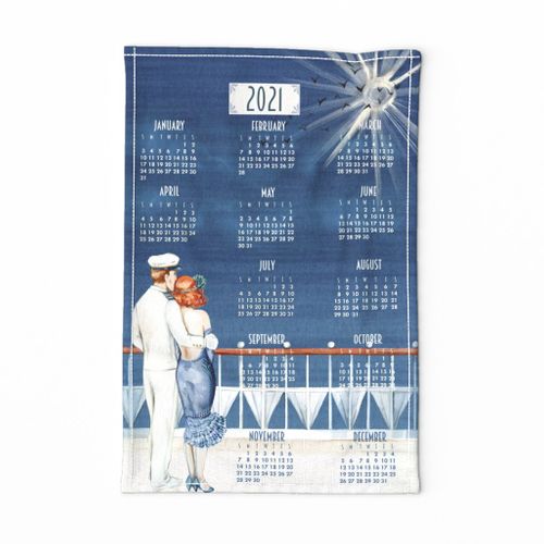
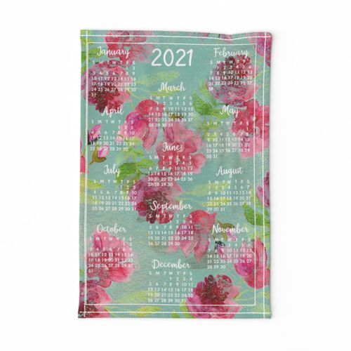
One thing that does seem to be a symptom of having everyone around all the time though is that my creative mojo seems to have up and left me! I just don't have the drive to design or make or create anything. The same happened last year. I'm pretty sure that part of it is a time issue; homeschooling the kids does take a chunk out of my day, but thankfully they're smart kids and don't need too much intervention so it's not completely immersive. Maybe part of it is my introverted nature - I do like to spend time on my own and with everyone around I don't get the chance to just sit with myself and recharge as much as I normally would. So I'm getting through the days, but I don't feel like I'm making much progress. In the past when I've felt lost and directionless making a good plan and daily schedule has really helped to get me back on track. You can't exactly schedule creativity, but it seems like a good place to start. Tea towel calendars are now available to buy in my Spoonflower shop. Choose from 4 designs - including a couple of variations on the theme of Birth Month Flowers featuring some gorgeous watercolour illustrations of the various flowers. For the Birth Month calendar designs I created a more traditional, ordered layout, and a more organic, contemporary layout. The designs were made to fit a fat quarter of Linen Cotton Canvas, but also fit onto a fat quarter of Lightweight Cotton Twill in case you prefer a lighter-weight material for your tea towels. And if you don't want to sew them up yourself, you can also buy the ready-made tea towels.
Redbubble now do jigsaw puzzles! They've been live for a couple of months and I'm slowly but surely enabling jigsaws for as many of my designs as possible. As many of them are repeating surface patterns, they make really difficult puzzles! You can see a few below with many more available in my shop. So if you enjoy a challenge head over to the shop and take a look. The jigsaws are available with 30, 110, 252, 500 and 1000 pieces (252 piece puzzles shown). |
AuthorI like bold geometric patterns, florals and bright colours. Archives
May 2024
Categories
All
|

 RSS Feed
Site powered by Weebly. Managed by Porkbun