|
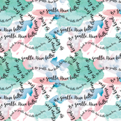
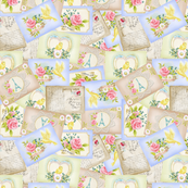
The challenge over at Spoonflower this week is to create a design featuring a composition of paper cut-outs to be displayed on table napkins. Instead of creating a brand new design I decided to tweak the teacup design that I created for the Chintz challenge back in November last year where I digitally cut chintzy patterned swatches with a teacup punch. To adapt it for the current brief I removed the foliage from the background and reverted to a solid pattern on the teacups instead of the white heart cut-outs seen in the original design. I also decided to go with a light blue background because I liked how it looked on the napkins. 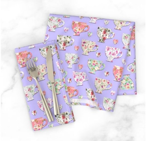 Head over to Spoonflower to vote! Voting closes on 7th April at 3pm EST.
0 Comments
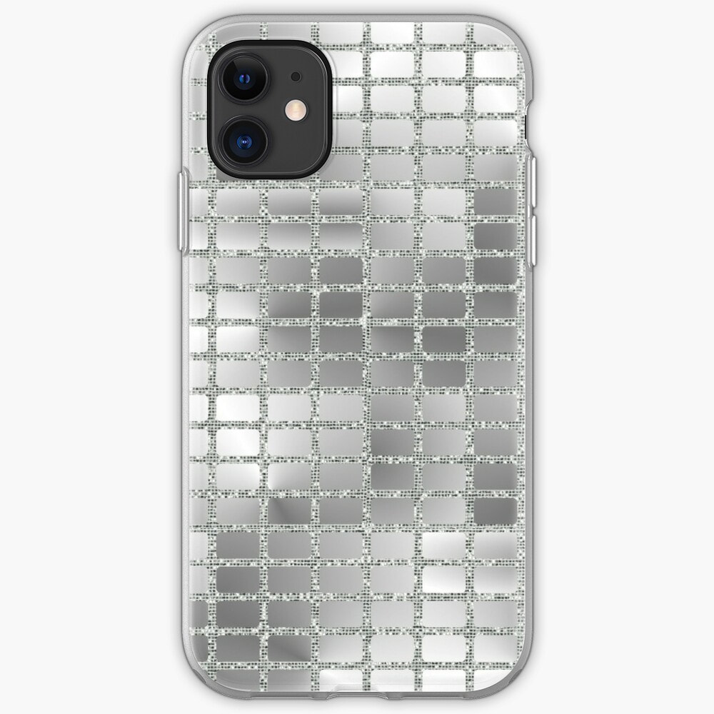
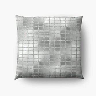
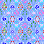
The latest Spoonflower Design Challenge is Faux Textured Wallpaper. The brief was to "create a repeating design that you can’t help but touch". I had lots of ideas for this, but not necessarily the time or the skill to make them happen. In hindsight I should have saved my Mirror Ball design that I used for the Roller Rink Nostalgia challenge for this challenge. But I didn't, so I had to come up with something else. I really like my collection of designs inspired by Spanish Tiles. Originally in teal and white, I have tried one or two coloured variations of the Entwined design. A while ago, while learning how to use mask layers in my graphics program, I played around with using textures with that design, so I decided to revisit those experiments for this challenge. I was originally going to go with a blue and gold colour scheme, featuring blue glitter and gold foil. 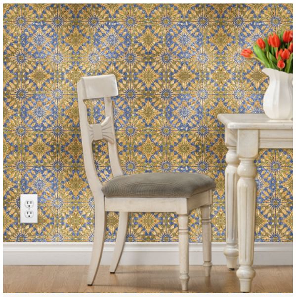 But I wasn't completely feeling it, so in the end I opted for this pink and gold version. 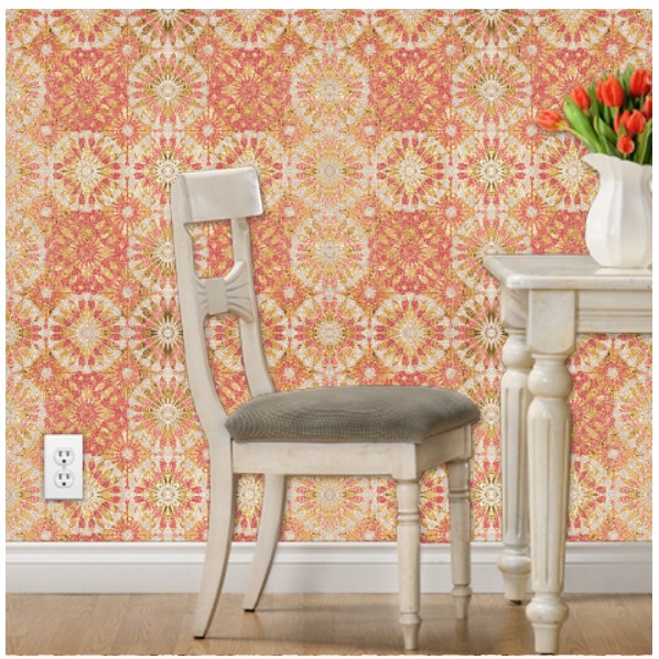 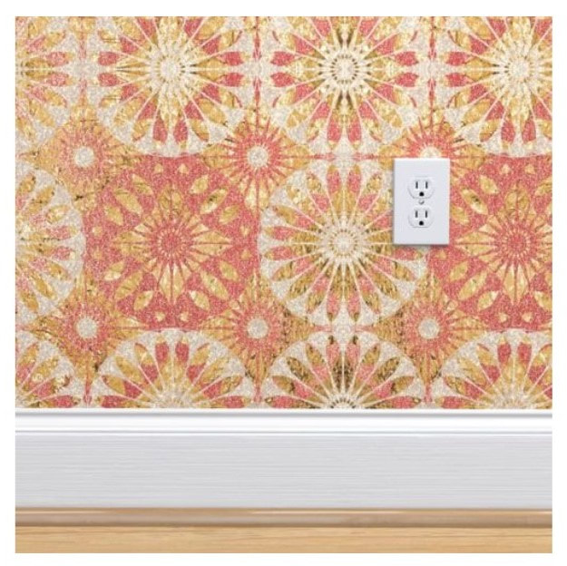 The textures that I used here are glitter and gold foil. Did I make the right choice for my challenge entry? Voting is open until 3pm EST / 8pm GMT on 17th March, so if you like what you see, please vote for me.
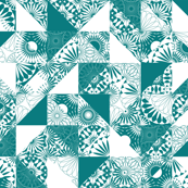
This design was created for the Spoonflower design challenge - Roller Rink Nostalgia. When I thought of the brief I immediately thought roller ball, so that's what I attempted to re-create and I think that I did a pretty decent job!
I think that it would look amazing on a shiny fabric, like satin and it works really well with home decor and accessory items.
Mirror Ball is available on a variety of products (including the above) in my Redbubble shop and as fabric in my Spoonflower shop.
So this is a little bit late! But it's important to look back at what you've accomplished from time to time to see your progress, but also to help you to decide where to go next. At the start of 2019 I did not have a regular art or design habit. I decided to enter the Spoonflower design challenge every week as a means to help me get into the habit, but also as a way to improve my design skills. After all practice makes perfect. I managed to enter all but 9 of the 47 challenges, so I'm happy that I achieved my goal. I had one excellent result, where I placed 45th out of 760 entries with my "Dancing Blossom" design. This also spurred me on to create my first and (so far) only collection. 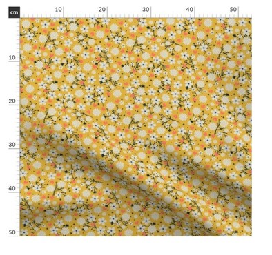 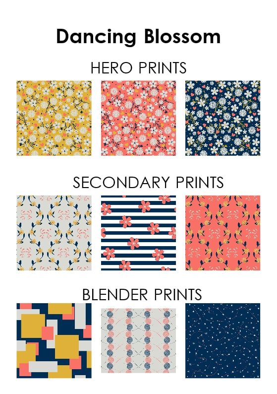 Some results were pretty good, some were pretty bad - generally I was fairly middle of the table. (I created a spreadsheet to track my progress!). The one thing that I consistently struggled with was time! I almost always found myself starting the actual design process a few hours before the submission deadline and subsequently rushing to complete it. That also left me no time for revisions, which very often showed. These were my top 10 designs (according to my placement in the Spoonflower design challenges):
Many of the above designs are also available in my Redbubble and Society 6 shops.
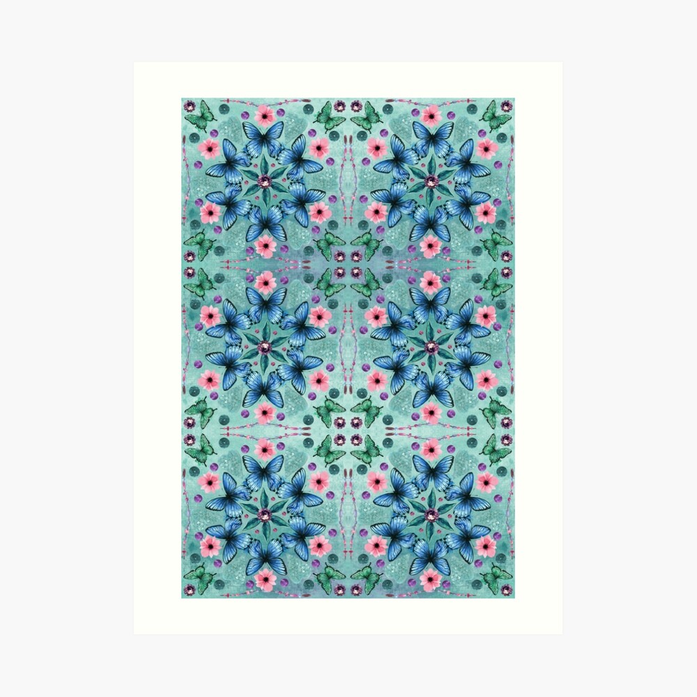
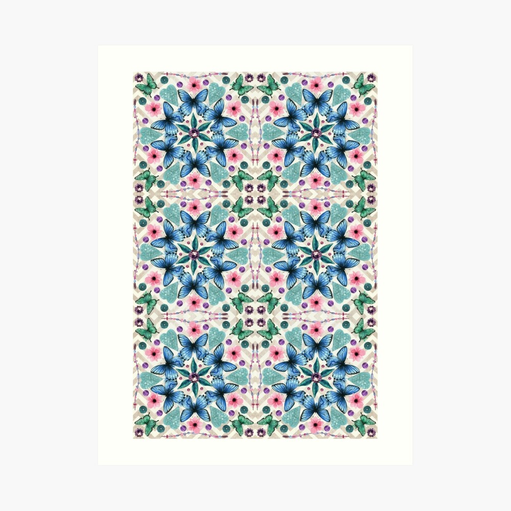
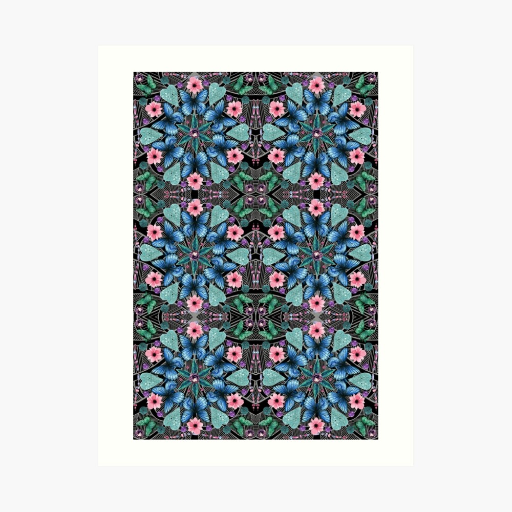
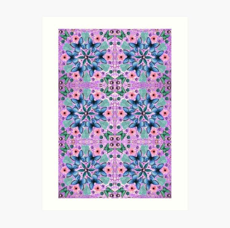
So what's in store for 2020? Well, many of the designs that I created in 2019 used graphics that I had purchased (Diamania, Spanish Trig and Merboys being the exception in the above list). So this year I want to improve my drawing skills and create more designs featuring my own original artwork. I think that that will really help me to discover and hence develop my own unique style. I recently posted about my latest design - A Kaleidoscope of Butterflies - which I entered into the Spoonflower Design Challenge. Part of the design process is to try out different colourways and there were several that I really liked, so I've added them to my Redbubble shop.
The first is a lighter blue version. I love the original teal version, but there was also something about this lighter version that really appealed to me. The second is on a light chevron background. The third is on a black background with white line work, which has a bit of an art deco feel. And the last version is on a purple background. Even though the design elements are the same, the different background colours and textures give four very different results. Maybe I'll revisit this in the future and play around with the colours of the butterflies, flowers and other elements.
|
AuthorI like bold geometric patterns, florals and bright colours. Archives
May 2024
Categories
All
|


 RSS Feed
Site powered by Weebly. Managed by Porkbun