|
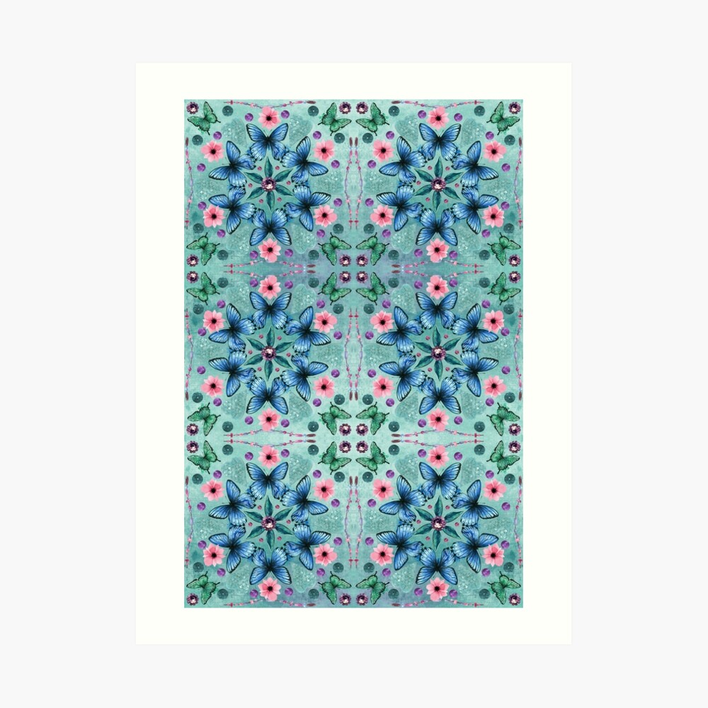
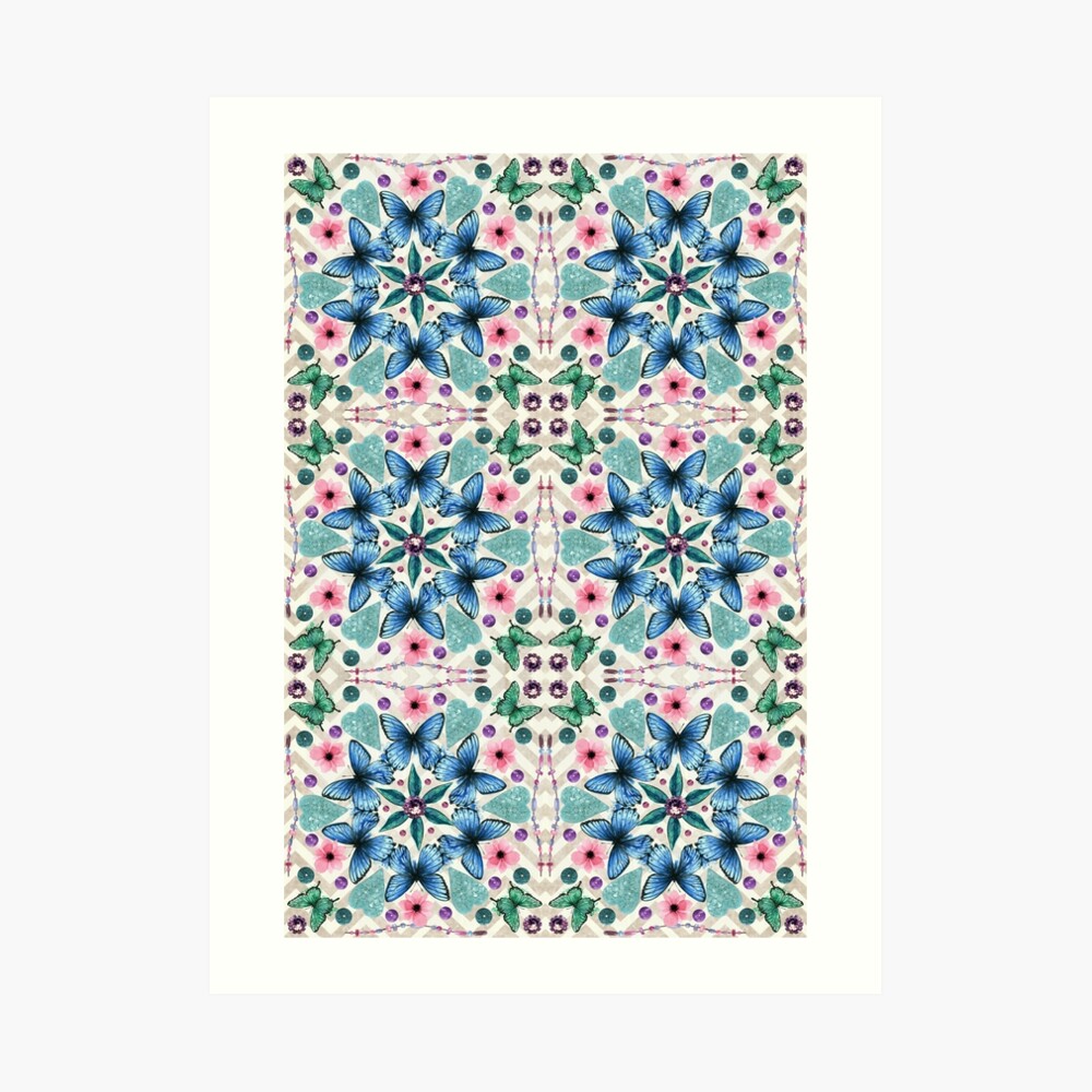
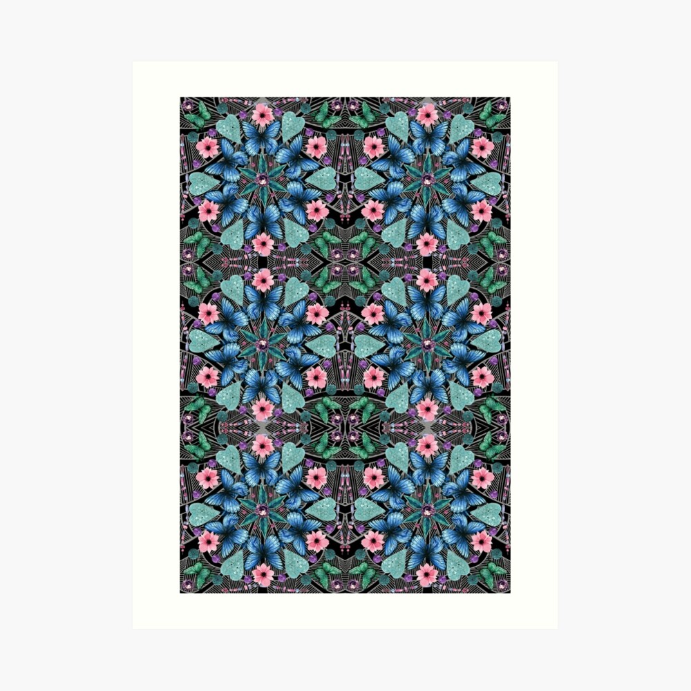
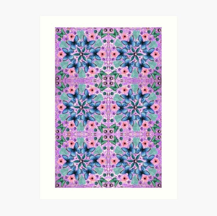
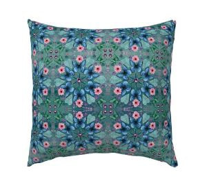
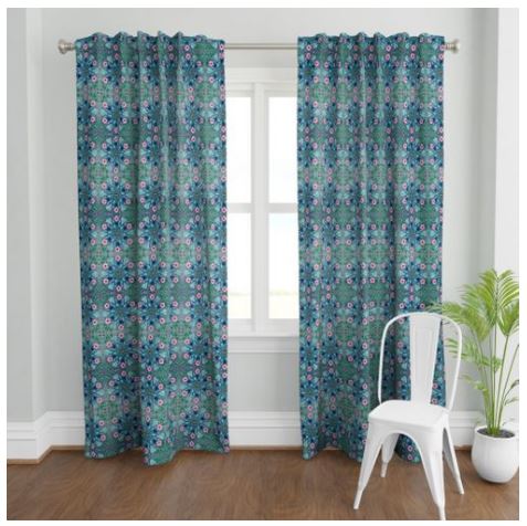
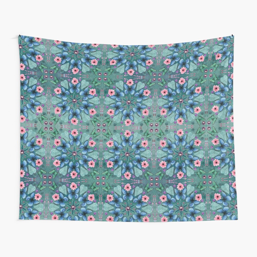
I recently posted about my latest design - A Kaleidoscope of Butterflies - which I entered into the Spoonflower Design Challenge. Part of the design process is to try out different colourways and there were several that I really liked, so I've added them to my Redbubble shop.
The first is a lighter blue version. I love the original teal version, but there was also something about this lighter version that really appealed to me. The second is on a light chevron background. The third is on a black background with white line work, which has a bit of an art deco feel. And the last version is on a purple background. Even though the design elements are the same, the different background colours and textures give four very different results. Maybe I'll revisit this in the future and play around with the colours of the butterflies, flowers and other elements.
0 Comments
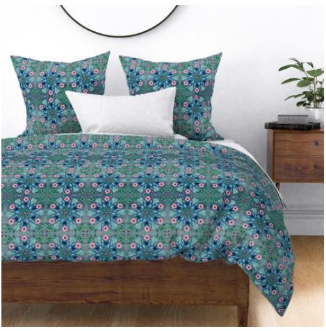 This week's Spoonflower Design Challenge is all about kaleidoscopes. As usual I sat down to begin about four hours before the submission deadline! I had kind of decided I wasn't going to enter but then I found myself with some free time so I sat in front of the computer and decided to have a play. The first elements that I went for were butterflies. I don't know if that was because deep in my subconscious I made the connection between kaleidoscopes and butterflies (the former being the collective noun for the latter) or if I just thought that butterflies would look pretty in a kaleidscope. The colour scheme came about organically once I had selected the butterflies that I wanted to use. It wasn't really a conscious decision, but I knew that I wanted to use pink flowers and then once I had the blue, tealy green and pink elements the purple just followed. It's a colour combination that I find myself using a lot. My signature colours perhaps? 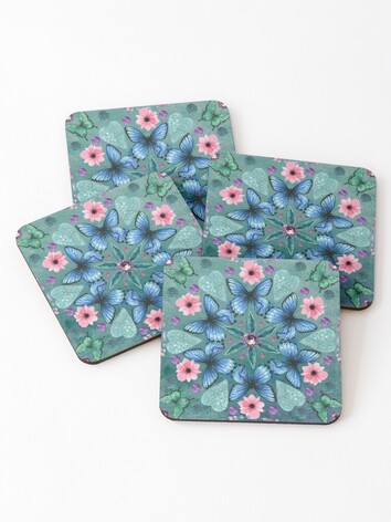 I considered using the pattern function in Adobe draw to create the kaleidoscope effect, but due to the lack of time I decided to simply create a tile with a geometric pattern and then use the mirror repeat function in the Spoonflower uploader to achieve a kaleidoscopic look. Somehow it all came together and I LOVE it! Voting is now open at Spoonflower until Tues 19th November at 8pm EST. I'd love your vote if you're willing to give it.
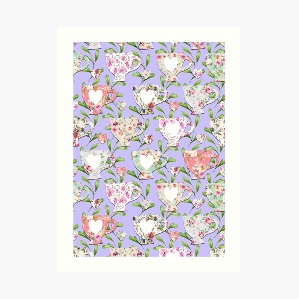
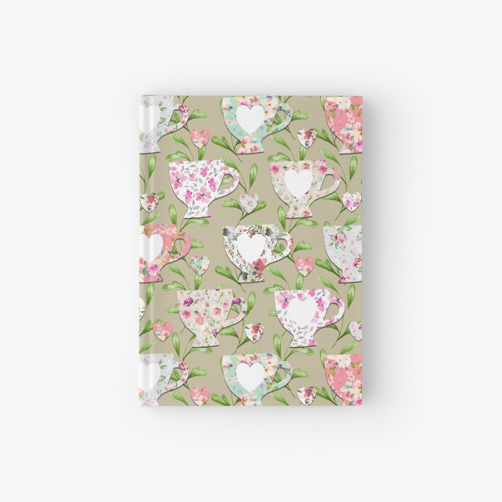
The theme of this week's Spoonflower Design Challenge is Chintz. Chintz is originally from India featuring repeating, colourful motifs printed on cotton. It gained popularity in Europe in the eighteenth and nineteenth centuries where it featured first in home decor (wallpaper, furniture and hangings etc.) , but eventually it began to be used on clothing. It became so popular that European countries banned importing it fearing that it would destabilise their local textile industries. Over time Chintz has been used to describe a particular type of floral fabric - think Laura Ashley. It fell out of fashion in the early twentieth century, but is now seeing something of a revival. If you're interested in learning more there are some interesting articles on the V&A Museum blog. 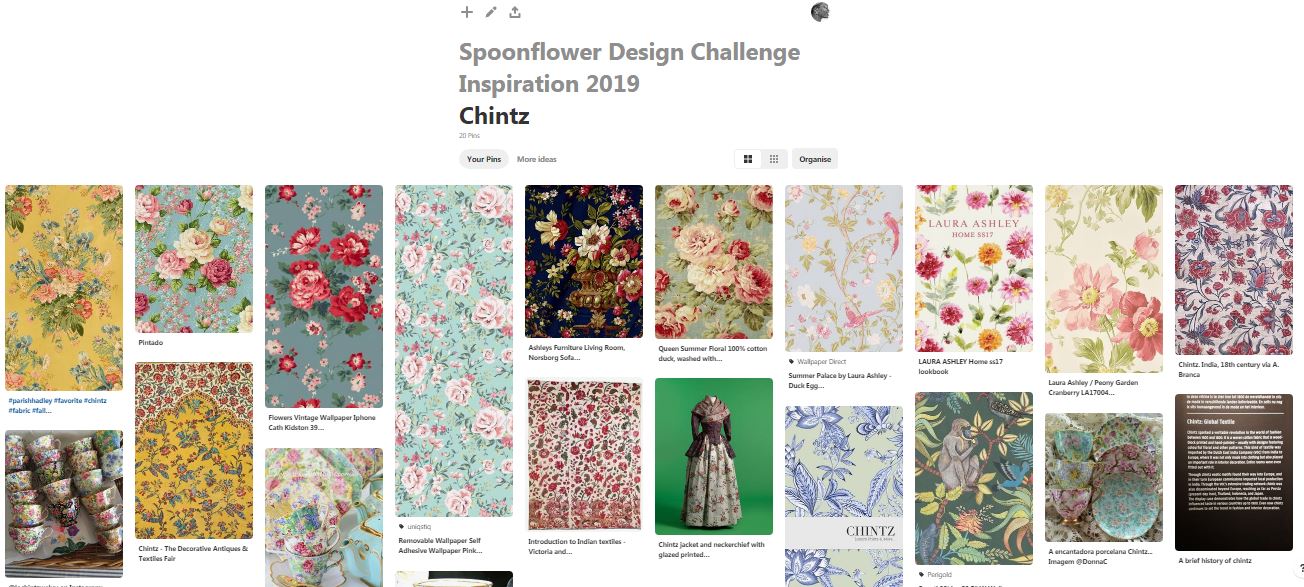 Chintz Inspiration Board on Pinterest While I was researching Chintz (check out my Chintz Inspiration board on Pinterest) I came across a lot of images of teacups and china. Hence the inspiration for my design. I wanted to go for a more contemporary feel, which I did by using watercolour, chintzesque floral designs. 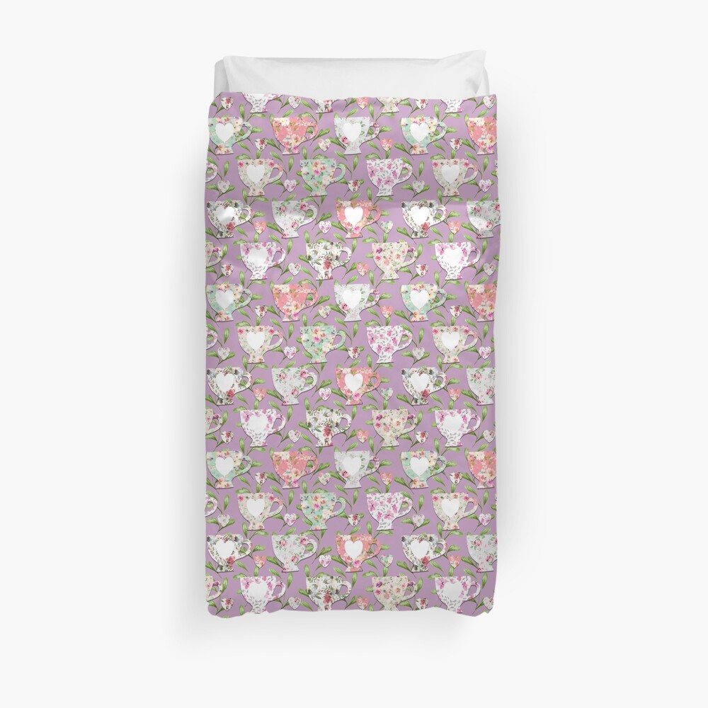 If you like the design please vote at Spoonflower. Voting closes Tuesday 12th Nov at 8pm GMT (3pm EST). In addition to the purple, I also used light blue, tan and pale yellow backgrounds. All four variations are available in my Redbubble shop and will be coming soon to Spoonflower. 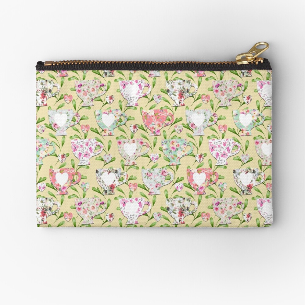
|
AuthorI like bold geometric patterns, florals and bright colours. Archives
May 2024
Categories
All
|
 RSS Feed
Site powered by Weebly. Managed by Porkbun